


After setting the General Layout Information and Display Specific Settings (Overview - Display button), proceed to select items under Setup Data, General Data, Settings, Raw Data, Result Data and DTM.
Then return to the Overview - Layout button to configure the display.
Display Button

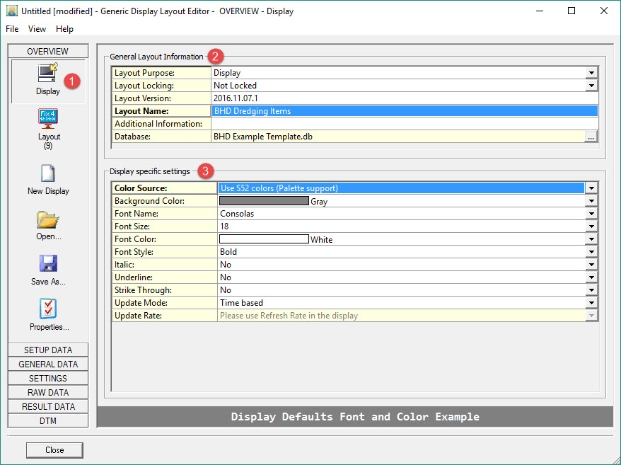

Layout Purpose cannot be changed when the Layout Editor is activated by creating a Generic Display from the Display Manager when online, i.e. Controller-Options-Displays.
Locking options are: Not Locked, All Settings Locked (no settings can be adjusted in the lower pane), Only Layout Settings, Only Data Settings.
When the Editor is invoked online by the Generic Display, the loaded database is always the current template database.

In choosing Color Source be aware:
-
-
Use S52 colors (Palette support). Only 16 different colors are available. These colors respond to the day/night palette of the Global Settings.
-
Use RGB colors. 140 colors are available (from file RGB.txt), but the colors will not be dimmed when the night palette is activated.
-
Update Mode options are:
-
-
Time Based - use the Refresh rate option in the display itself. Requires a valid Steered Node in the Controller.
-
Fix Based - updates the display at one of several fix intervals, i.e. every fix, every second fix, every fifth fix, etc. (see drop down list). Fix mode is set in the Controller - Settings - Session Setup - Fixing.
-
System Based - Select the system used to trigger the display, i.e. whenever new data is detected from that system, the display is updated.
-
Return to: top of page.
Layout Button
Changing the Layout via the Layout Editor
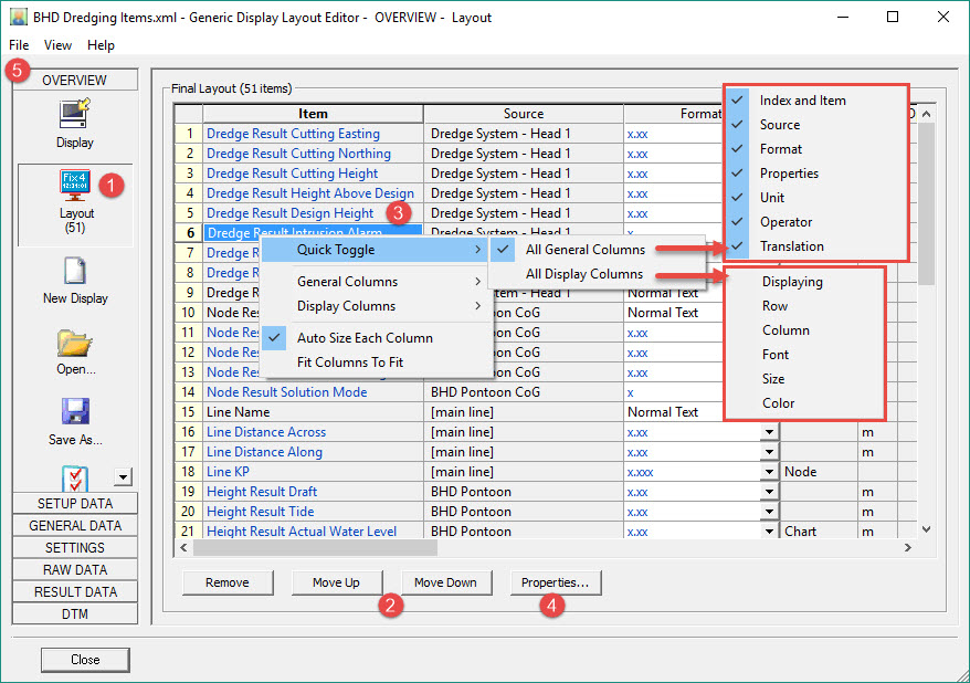
This page shows the layout of all items selected so far.
Saving the layout writes an XML file to the \CurrentProject\Settings\Display folder.
One of the ways to to do this is to highlight an item and use the 
Another option is to use the mouse in the actual display to drag and drop individual or blocks of items.
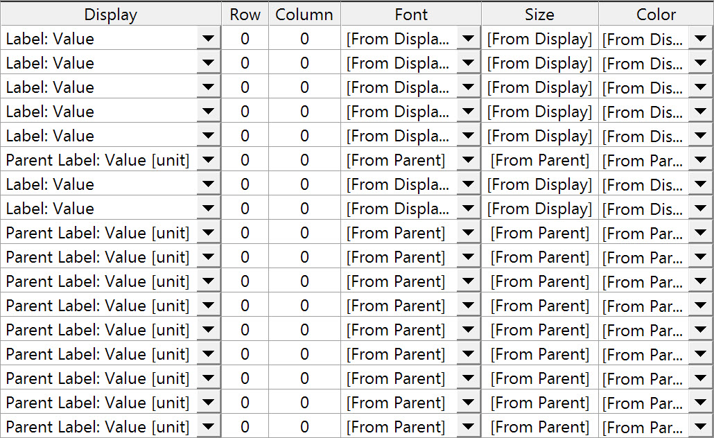
Right clicking anywhere in the table pops up a menu with options, one of which is to add mode columns (Display Columns).
The following Display Columns can be added:

-
-
either double clicking on an item.
-
or highlighting an item and pressing
-
In each case the definition page for that item is opened.
Some properties are directly editable in the layout table.

Properties Button

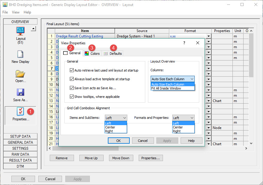
Save Icon acts as Save As: the icon Save As opens a Windows dialog. When unchecked this icon is a Save button. The existing XML is then saved in its current location.
Show Tooltips where applicable: Default is ON, meaning tool tips are shown when hovering the mouse over an icon.
Grid Cell Combobox Alignment: governs location of Items, Sub Items, and Formats.
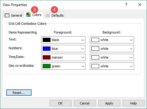
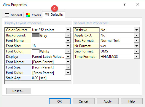
All parameters are fairly self explanatory.
Return to: top of page.
Changing the Layout in the Generic Display Dialog
In addition to the changes that can be made in the Layout Editor itself, Items can also be moved around within the main Generic Display dialog itself.
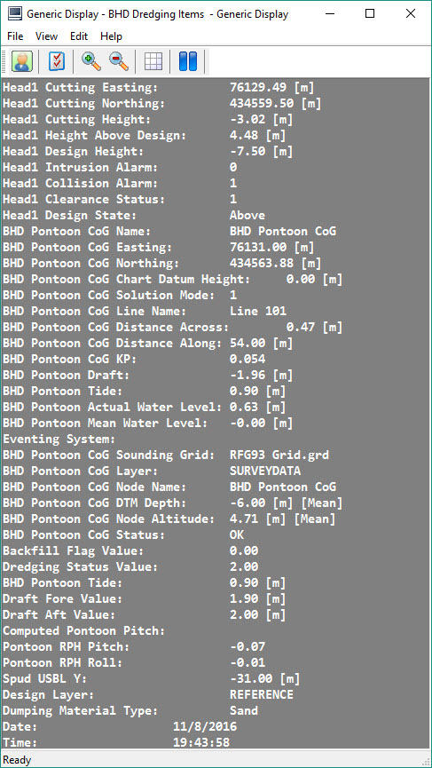
The next image illustrates what happens when you click on an item, in this case 'BHD Pontoon CoG Sounding Grid', and drag to another location; the whole block of text below this item is also picked up and moved.
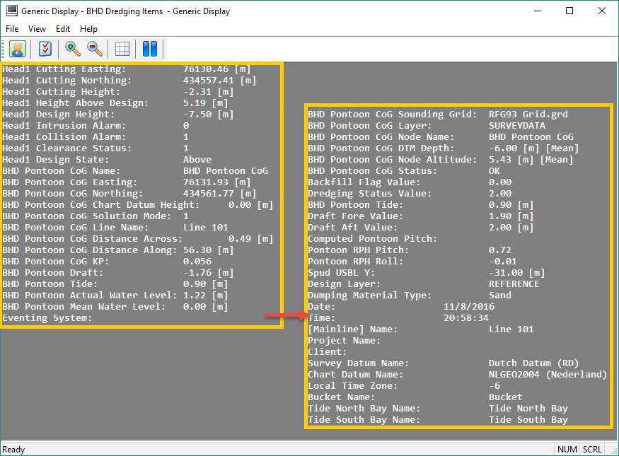
This means you have to separate blocks of text as illustrated in the next image where 'Date' was clicked and the block of text below was moved with it as the mouse was dragged to the left.
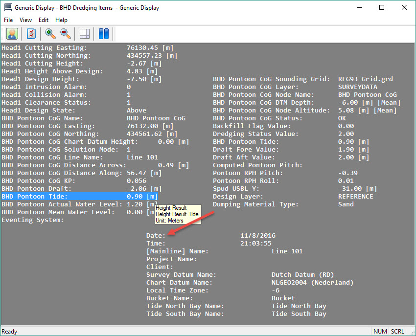
In this next image you see that there are several blocks created.
Of course the idea is to move items around so related data are clustered.
In order to accomplish this you may have to separate individual items so each can be moved independently.
Once an item is isolated from other items it can be moved individually from then on, even when positioned right under another item.
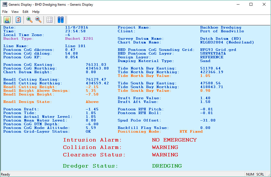
As an example the display could end up with the layout shown in the next image.
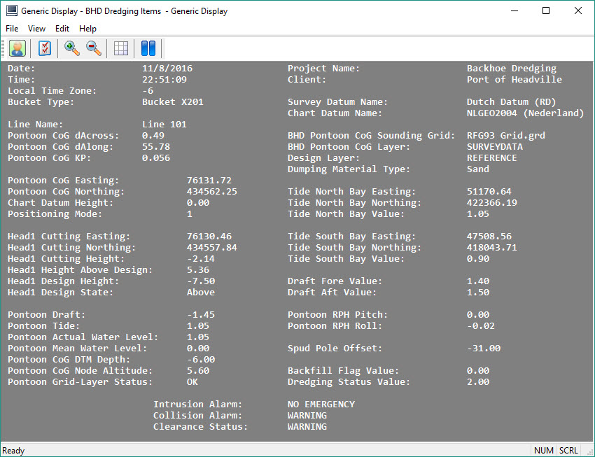
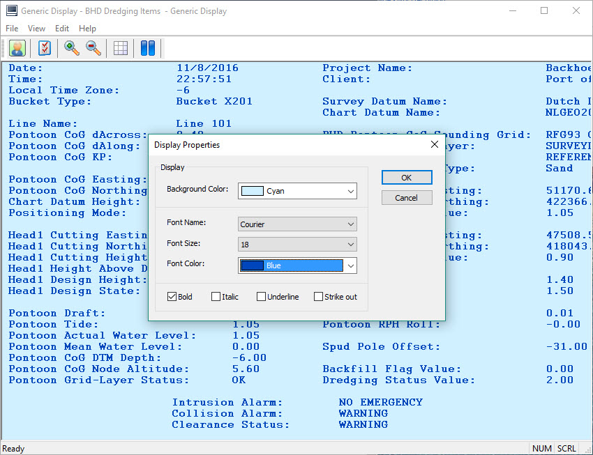
Next it might be useful to highlight certain items with larger text and/or different colors.
Using the right click menu select Display Properties. Modify one or more of the parameter values and notice that the changes apply to all items in the dialog.
In order to change individual items, either double-click on the item, or right click on the item and select Layout from the menu.
Each method takes you to the appropriate page of the Layout Editor.
In the item Properties pane, modify any one or more properties.
The Display and More Properties parameters offer the following options:
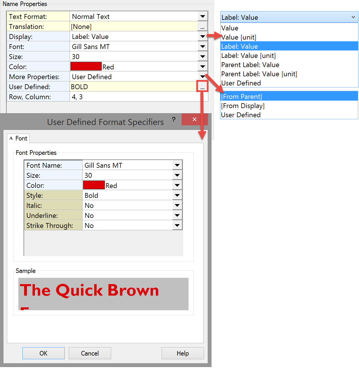
If User Defined is selected under More Properties, you can click on the browse button 
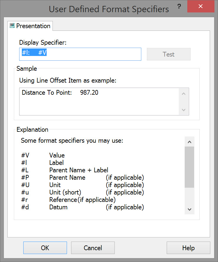
Here you can use predefined specifiers, your own text, spaces and tabs to define the label and position of the item value.
The final display might be something like this:
Return to: top of page.
Return to: BHD - Generic Display.