How-to Time Series Multiplot
This how-to briefly covers how to use the Time Series Multiplot to view observed and computed parameters.
On this page:
Introduction
Time Series multiplot is used in addition to other Qimera tools to Quality Control, QC, and trouble shoot data. The Time Series multiplot is a graphical view of the time series (extracted from raw sensor data) and computed data (QPD) available in a file, The tool enables to plot a correlation, for example GNSS height versus motion sensor heave versus nadir beam of the multibeam system. The tool is capable of overlaying observations from multiple systems in one plot.
Any editing required on raw observations needs to be done in Time Series editor and can't be done in multiplot.
How to work with the Time Series Multiplot
Step 1: Load Sonar Files and Open Time Series Multiplot
Create a new project and load raw sonar files into your project. See Getting Started for more information on how to do this. Enable the Time Series Multiplot dock in the Qimera Window Menu.
Observed parameters are available in Time Series multiplot once the raw sonar files have loaded. To enable computed parameters, you need to have the data processed.
Step 2: Configure Series
In Project Sources Window highlight the file you want to investigate in Time Series Multiplot, go to Time Series Multiplot Window, and click on Configure Series (see Figure 1).

Figure 1. Select Configure Series button in the Time Series multiplot .
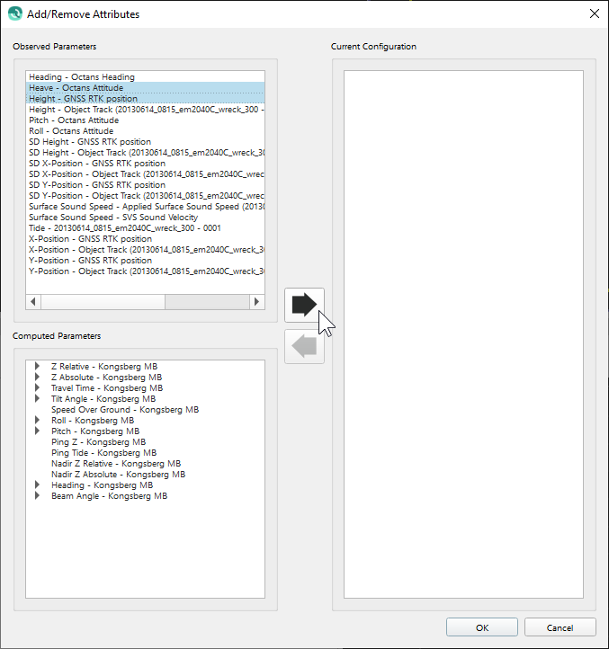
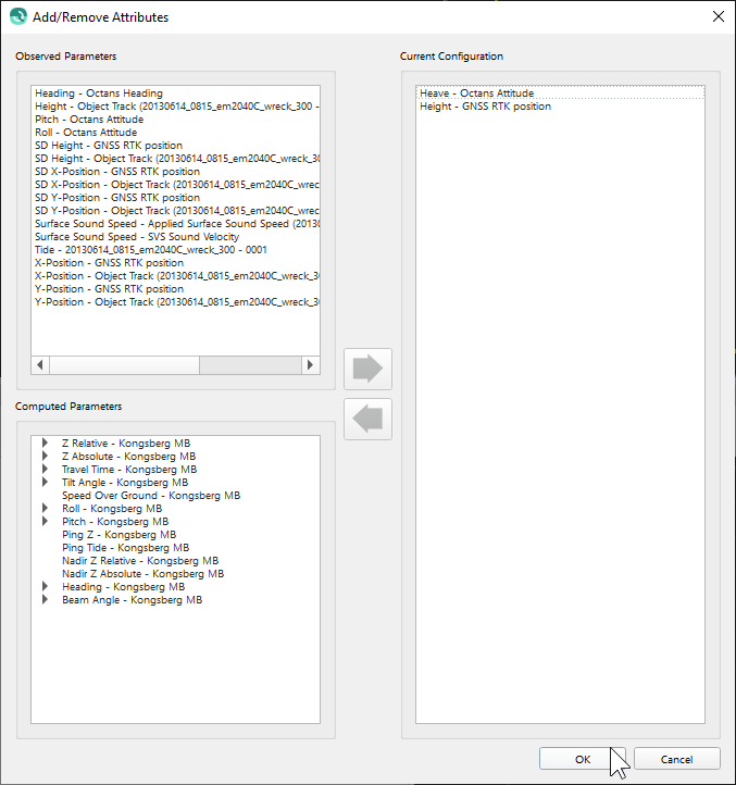
Select the Observed Parameters, taken from the raw files and Computed Parameters, taken from the QPD, you want to review. Select the right/forward arrow (see Figure 2a). The arrow is moving the selections to the right "Current Configuration". To remove a parameter from the current configuration, select it and select the left/back arrow. Select "OK" (see Figure 2b) to create the time series multiplot with the current configuration chosen.


Figure 2a and b. Select parameters required and select the right arrow to move to current configuration.
STEP 3: View the Graphs
Time Series Multiplot has drawn two graphs, GNSS height versus motion sensor heave (see Figure 3). In the example below, you will find that GNSS height and Heave observations are out of sync. Heave sign convention seems to have been set correctly (heave is positive up).

Figure 3. Time series Multiplot GNSS height vs heave
The Multiplot display will also show a scatter plot (cross correlation) between two selected parameters (see Figure 4). The scatter plot can be toggled on and off by using the Time Series Multiplot dropdown Menu 

Figure 4. The scatter plot between two selected parameters.
STEP 4: Adjust the View in the Time Series Multiplot Dock
With the selected configuration and screen layout, you can easily step through the raw sonar files available in the project, by selecting a file in project Sources Window or by mouse clicking on the navigation in 4D scene. Change the graph color using the color button (see 1 in Figure 5) or change the line type of the graph using the line pattern button (see 2 in Figure 5). Change the plot scaling using scaling series mode button (see 3 in Figure 5) or key combination Ctrl+ scroll mouse wheel. The offsets and scaling can be adjusted in the toggle boxes at the bottom of the time series multiplot dock (see 4 in Figure 5).

Figure 5. The tools to adjust the view of the graph are numbered.
